When I saw this, it immediately jumped out at me. The girls arm is anatomically wrong. Seriously, I even looked online just to be sure (since I don't personally know any 13 year old girls) . Even at a young age, with the lower part of the arm against the head like that, the elbow would be much higher and the forearm would be resting on top of the head. It's just freaky.
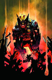
This is here not because of the Wolverine drawing (which is great BTW), but because of the shadows below Wolvie. Since there are shadows in front and behind him of the same value, its hard to tell one from the other. It flattens out the composition and destroys the illusion of depth. That smoking gun barrel in front ends up looking like a falling ember. Wally Wood showed what I'm talking about better than I can in 22 panels that always work. Check it out here: http://horrorthon.blogspot.com/2011/07/wally-woods-22-panels-that-always-work.html
Fail. Simply a fail. Why the designer thought it would be a better idea to use shitty looking photos and ugly computer graphics instead of close ups of Kirby art is beyond me. Let's not even get into the logo work. FAIL FAIL FAIL!!!
Characters ripping through other art is an old classic, but the trick is making sure both elements are separate and readable. This cover fails at that. It's too busy. Sure it's rendered very prettily but in some ways, that's what makes it hard to read.
Is this a cover? Or an interior panel? The design, and sound FX make me wonder. I never understood the 30 foot long Batman cape either. I know a lot of fans love it along with the "butcher knife" bat ears, but I always liked the more efficient looking Batman myself. Different strokes I guess.
Ahhh, my favorite subject... archery. This time the artist didn't even DRAW a bow string. What is she gonna do? Push the arrow at you? The rest of the cover is fine. It's the classic "coming at you" action cover, but the fact that she's the main focus, made the lack of that one detail painfully obvious.


Obviously you've never had an arrow pushed at you before. Terribly painful; physically and emotionally.
ReplyDeleteWell, the X-men cover does look a bit freaky, but I think that's supposed to be Kitty Pryde (I could be completely wrong) and she's phasing her hand through her head for some bizarre reason. It's not one of Kaare's best covers though.
ReplyDeleteThat isn't the issue. It's that her arm isn't long enough.
DeleteAh, Gotcha Dave. Sorry about that.
DeleteBallpark measuring with a pencil, those arms are the same length.
DeleteShe's definitely phasing her arm through her head, which is going to play with perspective. Put your arm over your eyes in that same pose, your elbow is going to be where hers is.
That cover is all about Kitty Pryde being Shadowcat and reaching *through* her head. If her arm looked like the side-by-side you'd posted, it wouldn't be Shadowcat.
Nope. Still wrong. Why? Simply because when the human arm is right beside the head as in the cover, the elbow has to be much higher. If you placing your arm in front of your eyes, then it's too far out to be in the same position as the girl in the cover. Regardless of the length of her other arm, the one raised isn't correct. Unless of course she has a birth defect.
DeleteI first read this as "since I don't personally own any 13 year old girls." It's funny and reassuring.
ReplyDeleteI couldn't possibly hate that Lee and Kirby book cover more than I do now. It's a crime worse than human trafficking.
ReplyDeleteYup! Couldn't agree with you more. Thanks for the crit. I was having issues with the Moriarty cover from the start. I'm just glad I'm not the worst offender up there... but you still owe me that beer buddy. ;)
ReplyDeleteI am pretty sure the Sam Keith piece is a interior panel,I've seen a different cover page for Batman through the looking glass.
ReplyDeleteHere is the actual cover:
Deletehttp://www.amazon.com/Batman-Through-Looking-Bruce-Jones/dp/1401225535/ref=sr_1_1?ie=UTF8&qid=1326828299&sr=8-1
Not a fan of it either.
I used to do target shooting archery a few years back and ever since then it has amused me to no end to realize how poorly people illustrate archers - especially in comics. Something people wanting to put some time into research should do is take a look at this site: http://www.centenaryarchers.gil.com.au/the10.htm and see how stance is covered, finger position when notching the arrow, and the position of the hand after shooting as a starting point and then branch out from there. The internet is full of great reference images on archery to get a solid handle of how people actually hold the bow and notch arrow.
ReplyDeleteThat Wonder Years cover is just a travesty though. Criminal to put Kirby's name on something and NOT show samples of his actual work.
Could the Kirby book have had rights issues? It doesn't look like a Marvel book so they probably could not use any of Kirby's marvel work.
ReplyDeleteEven so, this is a horrible way to solve that problem.
DeleteAgree on all except Keith's Batman (I don't think that's the cover though). If that was the Batman cover I think it would still be a nice image, there's a nice flow with the cape drawing my eye to Batman and the bunny. Just feels like your issues on this one is more because of the style of the artist than the composition, etc... I know he's an acquired taste, but he makes it work, as opposed to a Liefeld, lets say.
ReplyDelete(Resurrection of a two month old post. Blame Erik Larsen.) I don't like the Wolverine drawing, either. His arms look stubby.
ReplyDeleteI think these must be useful to you.
ReplyDeleteทีเด็ดหวยยี่กี
สูตรหวยยี่กี ruay
แทงบอล ปป คืออะไร
ขอพรท้าวเวสสุวรรณ
หนุ่มใหญ่ขับรถวัด ดวงเฮง ถูกรางวัลที่ 1
Thank you for your interest.