We start this off with Mignola. What can you say that's not already said? Mignola's composition is so strong, it's bullet proof.
Man, what a wonderful cover. The idea, the painting, the colors...everything is readable without competing with the main subject of the cover. Strong design by using the "A" frame design. I would have moved the credits up a bit to balance it out with the story title, but that was probably out of the hands of the artist. It's covers like this that raise the bar of "comic book" illustration to a higher level.
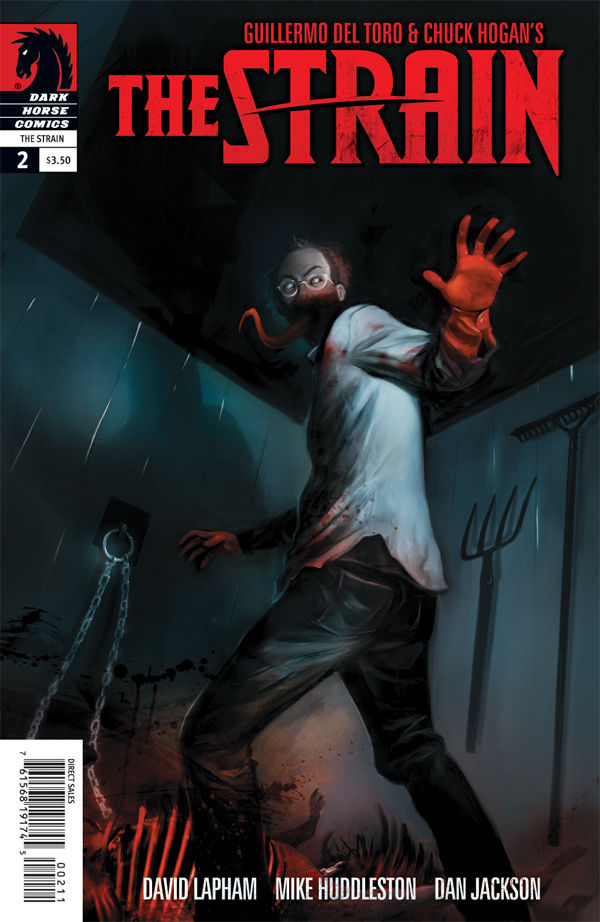
Man, I liked this the first time I saw it in previews, and I still like it now. That bloody hand just POPS! And it's got mood for days. It shows you can do dark moody covers and still make them readable. I'm glad the production dept. picked red for the logo, although I would put the UPC box on the right side. Nothing interesting going on on that side compared to the left where all the gory bits are.
I also talked about this a while ago on twitter. So much going on, and yet the important parts are clearly defined. It allows you to discover the other elements at your leisure instead of being hit with them all at once. It's artists like this that make me think I'm in the wrong field.
Alex Ross did a really great job here. It's a classic design that really works when done well. The shift from red to grey/black works wonderfully. Also, making Flash all red is a nice touch to bring the two together. I'm not sure I would have liked it as much if he was normally rendered with regular colors.
This cover is on here because I was impressed that the artists pulled off nicely what would have killed me: An underwater action scene that's interacting with the surface above. Also, it's an exciting angle. I'm even gonna forgive the the breaking of the law of physics that states that a bullet traveling through water is only effective for a couple of feet at best. It's a comic book after all.
ACTION!!! A classic example of the How to draw comics the Marvel Way cover! Captain America pops! Falcon is right beside him, face front and kicking ass. It just works.


Who did the Cap cover? Alan Davis?
ReplyDeleteLaura Martin colour too.
DeleteShe knows what she's doing.
Thanks for the post Dave! The Buffy cover paintings have been awesome, the only problem is the interior art (while I don't expect a fully painted issue) drops off tremendously. It's often impossible to tell who's who, which is huge when trying to make them look like the actors. But in 'Angel and Faith' artist Rebekah Issacs is doing an amazing job with the likenesses of the actors, great work.
ReplyDeleteDave, I'd like to read your thoughts on the cover design of one of my favorite books, THE SIXTH GUN. I admire the thinking outside the box but I feel the split cover art makes it hard for one idea to stand out.
Thanks again
Rich