Simple, elegant, powerful. A perfect case of less is more. Anybody who knows my work, knows I'm a sucker for two tone color. This cover lets you know this book is more than just an average comic book. The type also helps a lot in that regard.
What I like about this cover besides the nice job on the rendering is that if you squint your eyes it still reads as a bold, readable design. And as I've talked about before, it does a great job of having depth. Foreground, middle ground and background. Plus it sets a great overall mood. Somebody is gonna get fucked up at the business end of that sword. No wonder nobody is on the street, he's a scary dude.
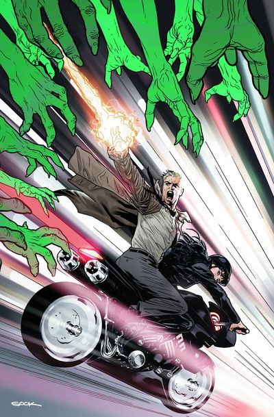
And finally, this one. It conveys a great sense of motion. And it's a super nice drawing. Design wise I might have made the hands darker and lightened up the BG. Or the opposite, darken up that area to make the hands pop more. As is, I feel like they compete a bit too much. But I still like the cover.


No comments:
Post a Comment