I start this off this week with this one because I actually like it. Except for one thing, the artist (I assume) knows NOTHING about how to use a bow and arrow.
And speaking of archery. Here's another example of how NOT to pull a bow back. I dare anybody to try it at home. But let move on to the real problem with this cover. It's so bland. Everything is the same value. And the design lacks drama. I did what I could to add a little bit by enlarging the foreground figure and adding dramatic lighting. It took all of 2 minutes. Shame the colorist couldn't be bothered to do the same.
Tangents and piss poor coloring rules this cover. I dare anyone to find me a light source on this one. It's all over the place. But what is certain, the colorlist LOVES the airbrush fade paint bucket in PS. At least the artist didn't go for the gratuitous crotch shot. Not sure why the artist included a big pole behind her to create that tangent with her leg and then drawing her arm at a 90 degree angle. Strange.
Another tangent. I get the artist did it to show that she's not a giant flying over the main character. But there are other ways to show that she's closer to us than the purple guy. How about some other details like wrecked cars and debris that her legs can overlap? You don't have to go crazy with it, just around the small figure. But still keeping the main design clean so she still pops.
So much wrong with this cover, Bad coloring, yet ANOTHER bad archery example, the foreground guy looks like he's eating the horse's head, and his arm. Ohhhh, the arm. Milton Caniff would ALWAYS draw beyond the panel to make sure what IS in the panel makes sense. Listen to Milt kids. He was a genius.
This is one here because of the horrible logo treatment. The Air Vixens logo cuts the illustration in half at a bad spot that makes it look like the knocked out characters are in another panel. But I guess if they had moved it up then it would have covered over some boobies. And as we all know, boobies sells covers.
I guess we're supposed to know who the character is. Also, I think there's a face in the BG but can't be sure. But I'm sure the logo with take care of it. So it was pointless to add the face in the first place.
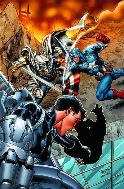
And finally, another example of everything element fight for my attention at equal measure. Feels like an interior panel, not a cover.
*note* this isn't the final shipping cover. The black blob wasn't the artist's doing. Here's the final.
http://www.comicbookresources.com/assets/images/preview/ed1b918i10716/prv10716_cov.jpg
Well, that's another week down. If I hurt someone's feeling. Get over it. The great thing about comics is you get a chance to do it better next month.


Hahaha! Good catch with the bizarre archery! Your quick fix with the Green Arrow cover looks significantly better.
ReplyDeleteI'm fascinated by these tangents of which you speak. Hope to read you elaborate on this!
ReplyDeleteWith the Demon Knights' cover, they lowered the background so the logos wouldn't cover the face.
ReplyDeleteThat said, I didn't notice the face in the clouds.
i actually think the last one aint that bad on the final shipping cover, i get the idea that there's two different stories not directly related, but i dont read that so i'm not sure.
ReplyDeleteI actually like the inclusion of Mettle ("the Purple Guy") on the cover featuring X-23. The Fastball Special is a classic move perfected by Colossus and Wolverine; X-23 is now a member of the Avengers Academy cast with Mettle, so a cover featuring her own Fastball Special is quite fitting.
ReplyDeletedoeswhateveracomicsblogcan : You obviously missed the context of my critique. Google "Tangent".
ReplyDeleteOh, okay, I get it now, sorry for the mix-up.
ReplyDeleteAnd I apologize for posting with my Blog handle, whenever I try to comment with my Google account Google seems to eat my comment; I can't even comment on my own blog without getting a "You do not have permission to comment" message.
Jay B
Ha, I think I can explain the weird Batgirl tangent.
ReplyDeleteImagine the artist used a girl on a strippers pole for reference. Everything about that pose makes perfect sense then. She IS balancing on that pole, with her arm simply moved to the ground, instead of wrapped around it in the back.
Also, god yes with the archery thing. Drives me nuts.