I really like the stylistically graphic nature of this cover. Garney does a great job with this. And I love the color choices. The only thing I would change would be to darken the dragon's body a bit to make the head pop more. Maybe use a shadow of the head on the body. But otherwise, fun cover.
Beyond the subtle color chosen, which I'm really digging, What made me notice this cover was how the use of the apple with the bite out of it told me instantaneously that the characters were from Snow White. The logo is nice also.
Not much to say about this other than I just think it's works. Using shadows to bring out the eyes and focus your attention is a classic device. It works.
I guess this is here because even though it's one of those "I'm gonna stand here and look like a badass" covers, it's at least done well. It also reminds me a little of the Modern Warfare X-Box game cover in the sense that they both use a glowing red element to set it apart from just a dude standing there.
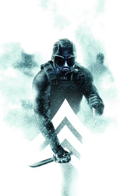
Same with this fine cover. The thing that keeps this design from just being a run of the mill badasses with knives coming at you is execution. A less is more approach and digitally painted beautifully. And adding the military ranking graphic also is a nice touch. Victor Kalvachev is scary talented and will be soaking up Eisner Awards soon enough.
This Bradstreet cover is simple but effective. With a nod to the humorous notion that being Pinhead has it's drawbacks.


On the second one, isn't that supposed to be Snow White, not Sleeping Beauty?
ReplyDeleteOops! You're right. Fixed it.
ReplyDeleteBecky's Thought Bubble cover is one of my all time favorites.
ReplyDeleteThis has become one of my favorite blogs. It's as interesting as it's instructive. A must read for all comic artists, I think – plenty of blogs and tutorials about making comics out there, but the subject of the cover is seldom touched upon.
ReplyDeleteWhen you said modern warfare, dont you mean Battlefield?
ReplyDeleteWhile nicely painted, I think the Morning Glories cover fails on a design level. The masthead placement looks like the designer gave up and smooshed it to fit in Adobe.
ReplyDelete