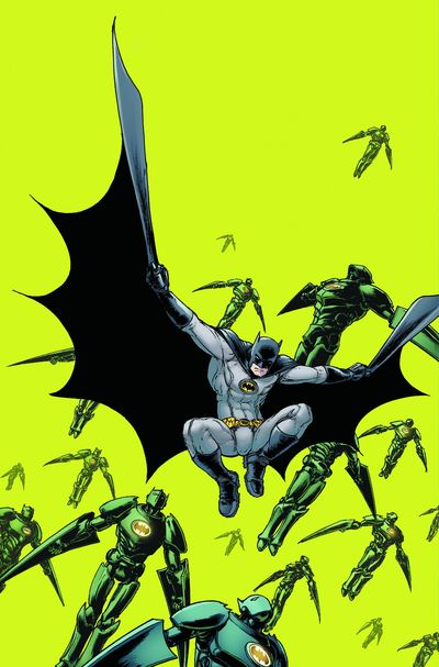
We start this off with this Batman cover. I remember walking into a store this week and no matter where I was in the store, this cover kept jumping out at me. That green just popped! Which ultimately is what a good cover is supposed to do. My only thought would have been to make one of the robots bigger in the foreground at the bottom to give it more depth. Bottom line. Great job.
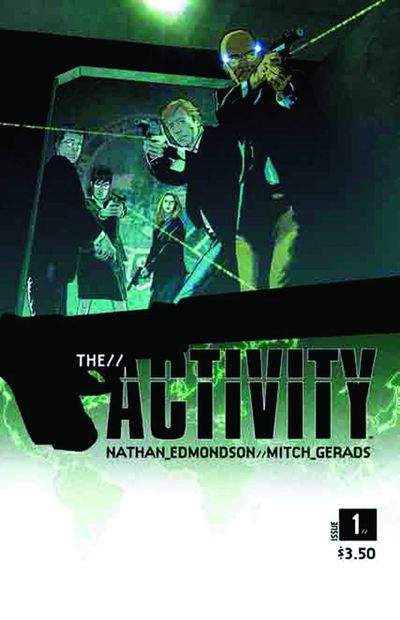
This just feels like a serious book cover. I like how the gun/logo cuts the design in half. My only suggestion would picked a different hue for the map at the bottom so it reads a little better as a separate element. But that's just nit picking it.
Whats not to like about this cover? Its fun, graphic and well done. The only thing I would have added would be a kid in the window with a shocked look on his face. Or a nude woman, haha. But then, as some of you guys out there already know, I'm an idiot.
This technically isn't a comic book cover, but it showed up in the listing website I look at to see all these covers. So it's in here because Jusko rocked this illustration. I really love the subtle use of colors. And the design a zig zag pattern to move your from the woods to the tiger, to her arm, down her leg then over to the cub reaching down and over to the title is really nice.
Reflections are really hard to pull off correctly. Especially when you have equally important elements under the glass. Massimo Carnevale is just the kind of bad ass artist who can pull this off with ease.
I almost didn't put this here. It's the kind of cover I like. But I was sure it was ripped off from Katsuhiro Otomo's Akira. But after looking through the books, I realized I was mistaken. So my apologies for thinking there was something wrong with this nice cover.


I love the scary claustrophobic feeling on "The Activity", the logo is an aid in this case rather than a deterrent.
ReplyDeleteJust out of curiousity, what would you say your favorite covers of all time are? Or which do you find the most inspiring to your own work? Just something I'd be interesting in seeing on a future post.
I, also, enjoyed Yardin's X-Factor cover. The look on his face just nails what happens to the character in the issue. Tho, I'm not as big a fan of the green on the Batman cover... yeah, it popped, but the puke green was a turnoff for me.
ReplyDeleteI would love to know what website you use to view all of these covers.
I was gonna mention that X-Factor cover last week, but, man, if you see the actual printed book, they ugly-as-fuck logo and Marvel trade dress or whatever really mucked it up.
ReplyDeleteStill love it, though.
Otomo did very similar images in Domu
ReplyDeleteHe also used it on the animated akira movie. TVs have their own built in light box.
ReplyDeleteI am glad you approved of the puke green, sir! Your reaction to it in the store is pretty much exactly what I wanted. Heck, even zenofgeo's reaction sorta pleases me. =)
ReplyDeleteI had the same experience with that Batman cover! It's amazing!
ReplyDelete